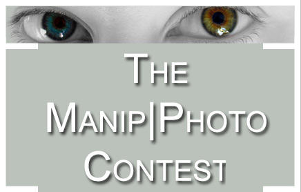
ShopDreamUp AI ArtDreamUp
Deviation Actions

The voting has finished! Today I calculated the final ratings. It was a very close race! We had three categories that were judged:
Photography
How much effort went into the photograph itself? Was it a random shot or well planned? Picture composition, lines, focus, quality, depth of field etc. are considered here.
Manipulation
How much effort went into the photomanipulation? Was it a senseless play with filters or a time-consuming process with many layers involved? Colours, contrast, composition of the elements, artistic skill (if something had to be drawn/painted) and so on are judged in this category.
Impact
How much thought went into the idea for the picture? Did it evolve by accident or does it have a certain concept? Do all elements work well together? Does it succeed in depicting an emotion, a theme, a message etc.? Do the title and description add to it? Is it original and unusual?
The winner of the first prize, which was chosen by me, is also the one who got the best ratings in the category "impact".
The winner of the second prize is who got the best total rating.
the third winner was chosen by the poll.
Thank you, my dear judges! And a HUGE thanks to
 for her most elaborate comments! She took a lot of time to analyse every picture accurately. Extracts from the comments I got from her and the other judges are presented along with the images.
F I N A L by

Photography: 3.66
Manipulation: 5.46
Impact: 5.72
Total: 4.95

"The fire looks very effective and stands out against the desaturated background. A lot of thought has gone into the concept and makes you think about the deeper meaning behind it." Fijay
"Though the photo was not the best i think he made the best possible of it! It's cut out very exact, it seems that he's soften a great deal and given a somewhat different structure to the clothes. He also changed a bit of the hair (neck and ears). Overall he made the picture look more painted, turned it to black-white and brightened the forhead- and glasses-part.
I think it already was a great deal of work to the photo. Further he added this firelike colours to his back. Actually - I think - it looks more like some kind of explosion, but somehow well done, especially the the just slowly fading ends of the fire, if you look close enough.
*mgdeath5 gave much thought to it. He did well with submitting a gloomy, forsaken and desperate mood. It's far lonely lowlands, colourless and foggy, only in the far you can see some towers.
And with the towers we come to the next point i have to praise: he referes to another of his pictures, where this towers are to be seen as well, only from another perspective. If you know them, you feel more involved to it, as if you were not only seeing one part of this world he created, because you recognise something else of this picture. You feel you know more of it, than only this one thing. It's something familiar and it seems to show more of the story he's got to tell.
This fact really grabbed me and keeps me thinking such as "How did this guy come to the situation he's in now? What happened? What will become of him?"" CathleenParagon
"The image impressed me with its great impact and composition. He didn't get the best photography ratings because of the bad quality of his self portrait, but we have to consider that every other element of this picture is based on his own photos, too. He seems to have put a lot of effort in creating this piece. The poem contributes to it to and help conveying the emotions of it.
But what made mgdeath5 deserve the first place was the commitment he made. He even made an animation of the cloud layers he used! That's the spirit we need
wins: Reliquia I by

Photography: 5.4
Manipulation: 4.7
Impact:5.2
Total: 5.1

"Very complex original images, I love the relic box (...) This was put together quite seamlessly, I was very impressed with it. (...) It's a pretty powerful image, almost offering the girl as part of a sacrifice for something. I don't know if that was the image intended, but it does exude some sort of dark meaning."claireskitten
"Actually there's a bit of bone in the middle of the box, bound to it with goldwire, where now the woman lies, wrapped with this golden lace. She took place to the bone, and her pale skincolour fits the image of bone, for a short moment i even thought of alabaster. And though i don't really know Latin i think to recognise the words "Innocence" and "Purity" around the woman and somehow they fit her, because the expression on her face has something innocent to me und the colour of her skin fits purity." CathleenParagon
"This is an unusual concept and the dark colours add to the mood of the picture. The pose of the photo looks well planned as it fits in with the rest of the image." Fijay
wins: Abstract + Birds by

Photography: 4.48
Manipulation: 5.48
Impact: 4.12
Total: 4.69

"I've made the experience that it's somewhat difficult and quite time-consuming to take pictures of animals, especially good pictures, because you never know when they're going to move and if they do you have to start an absolute new trial to catch them on a picture that's good enough to be used.
(...)
The choice of colour fits well as it seems that he used solely colours that are mostly found on the birds as well. He further seems to have used brushes to create the numerous and moreover very detailed textures rather than filters. And though the pen works might look very undesigned they fit very well to the entire picture.
Another thing is that he didn't florid the picture but let a bit "free" space with not too intensive colours.
What the picture lacks, though, is contrast. He chose well with the colours and the composition but alltogether it could have done with more contrast to the colours. Like this they look a bit greyish.
In my opinion the picture has a very individual touch to itself. I haven't seen something similar yet. Too, the different components match well and it indeed takes some time to make out all the hidden details, but without overwhelming one while studying the picture.
What i miss though, is something like a message. It's a beautiful picture but it's somewhat vacant." CathleenParagon
"It's very detailed and looks like a lot of effort has gone into creating it. The colours used complement the birds." Fijay
"I think this is an AMAZING manipulation. I love every intricate detail in the background, and how the birds are woven into this abstract world so seamlessly. It feels like *JamesTu had an emotion in mind when he designed this, but I can't really figure out what it is from the picture." claireskitten
wins: Phantom's Wife by

Photography: 4.4
Manipulation: 5.06
Impact: 4.36
Total: 4.61

"Though she didn't use many tools, she made a good job of it - and maybe it is even better for the fact that she didn't use many tools to create a good work. At first sight I didn't even believe that the mask was made of her skin but looking closer it's visible. Nonetheless it's properly done. There're somewhat 3D-effects at the masks edges, so it doesn't look as if she'd only drawn a line on the skin but it really is silhouetted against the rest.
Then there are the eyes. ~0bsessi0n made a good job of erasing the pupils. It's a clean changeover so that the eyes look as if there'd never been any pupils, but always only the iris. It's the same with the eyebrows.
The picture has an allover mystical mood - the partially hidden face, those pupil-less eyes that nontheless seem to stare you down, the dark colours. But - though i'm sure she planned this picture - it lacks a message." CathleenParagon
"Nothing really special about the photograph itself, but a nice one nonetheless. (...) I was VERY impressed by this photomanipulation. I found it so wonderful that she explained the steps of her manipulation as well, and used so few tools as well!" claireskitten
"The black and white colours help set the mood, and the fact that it was all done using doging, burning and cloning is very impressive!" Fijay
The long journey... by

Photography: 4.02
Manipulation: 4.76
Impact: 4.84
Total: 4.54

"The concept looks simple but effective, and the title adds to the meaning. The colour scheme also emphasises the more light hearted feel of the image." Fijay
"I really love the clearness of the photograph itself, and colors are beautiful. Wonderful job on cropping out the ship, but it's not a terribly complex job. It's a very calming, lovely picture. I love the finished product." claireskitten
"I imagine to be aboard this small ship, sailing over a cup of chocolate capuccino. It's not that big, if we look down on it, but to be a small passenger on this small ship it might indeed become a long journey. It somehow reminded me of the final scene of "Men in Black" as our whole universe is shown as a small taw, and we're so small that we don't even suspect it, let alone imagining it (i for myself don't like the thought of living in a more than giantic taw). So what do folks on this ship think about the world they live in?
It's an interesting picture with an even more interesting thought-provoking impulse and very very well composed as well!" CathleenParagon
Self Portrait: Reel by

Photography: 4.48
Manipulation: 5.48
Impact: 4.12
Total: 4.69

"I know how dorm rooms are, they're not the most photographer-friendly things. He did a great job considering the space allowed. (...) It is what it is - a self portrait. But at the same time, it shows different facets of the same person, so it does have some meaning." claireskitten
"The Manipulation doesn't look as if ~Ernelson had used the frame with the original pictures, but combined them afterwards, so he must have planned it, because the setting of his hands fits quite well to the form of the frame.
He must have added the four selfportraits to the background picture seperately and for that cut them out first. What's visible of the cutouts is made clean and proper without blurry or chiselled outlines.
Then he had to fit the pictures into the frame what might have been a good amount of work.
The colours still look natural. So alltogether i think he's done a good job of the manipulation.
(...)
The picture leaves an odd impression to me. It shows the man as a passive watcher to the world, from somewhere else, at once fascinated, scared, disbelieving and somewhat upset(? difficult to say) of whatever he might see. But regardless of whatever he thinks of the outer world he's watching, he's always caught behind this window and so disabled to do something about what he sees.
It's not that i share this opinion, maybe i've even understood the true meaning wrong, but this is what i think of this picture. The fact that it made me think shows that it has a message and is not only some meaningless randomwork." CathleenParagon
"This is an interesting idea, and a lot of time has been spent to create it. The photos used fit together nicely." Fijay
Snow Queen by

Photography: 3.93
Manipulation: 4.04
Impact: 3.54
Total: 3.84

"I really like the way this one was set up. From far away, it looks like a pretty simple image, but upon closer examination, you can see each intricate layer added onto it. I love that you can't see her eyes. It adds to the impersonality of the character." claireskitten
"She worked a lot with textures that fit very well into the overall picture in colour and shape. Some are feint and so others only the more viable but none of the textures destroys the effect of the others, they harmonise well, and give a structure to the picture that it definately would have lacked without them.
*poetry2capullet also seems to have used at least one filter to the face - it looks a bit blurry at the mouth.
Alltogether i'd say, it was not much work with the photo but the textures might have taken some time.
I really like the look of the picture. The cool blue colours, the icy loking textures, the halfhidden face.
but unfortunately it's a too common theme. There are lots of pictures that look similar to this one.
You can see from the description that *poetry2capullet wanted to express something with this picture (quotation of a poem), but the picture doesn't really fit the poem. It talks of a cold and somewhat cruel person, but the person on the picture smiles too friendly, in my opinion." CathleenParagon
"The textures and the colour scheme work well to add to the effect of winter, and shows an interesting interpretation of the Snow Queen." Fijay
Thanks to all who participated
![[OPEN] AI Adopt / Swords and Magic #259](https://images-wixmp-ed30a86b8c4ca887773594c2.wixmp.com/f/28e9e73b-ef6a-4497-8e2f-1ec8e4d2352d/dgori1z-411c5560-89bb-41cf-bfbc-aa41026a1521.png/v1/fit/w_375,h_310,q_70,strp/_open__ai_adopt___swords_and_magic__259_by_aivhyriel_dgori1z-375w.jpg?token=eyJ0eXAiOiJKV1QiLCJhbGciOiJIUzI1NiJ9.eyJzdWIiOiJ1cm46YXBwOjdlMGQxODg5ODIyNjQzNzNhNWYwZDQxNWVhMGQyNmUwIiwiaXNzIjoidXJuOmFwcDo3ZTBkMTg4OTgyMjY0MzczYTVmMGQ0MTVlYTBkMjZlMCIsIm9iaiI6W1t7ImhlaWdodCI6Ijw9NjYyIiwicGF0aCI6IlwvZlwvMjhlOWU3M2ItZWY2YS00NDk3LThlMmYtMWVjOGU0ZDIzNTJkXC9kZ29yaTF6LTQxMWM1NTYwLTg5YmItNDFjZi1iZmJjLWFhNDEwMjZhMTUyMS5wbmciLCJ3aWR0aCI6Ijw9ODAwIn1dXSwiYXVkIjpbInVybjpzZXJ2aWNlOmltYWdlLm9wZXJhdGlvbnMiXX0.XMcP6OBexyPMgW6vXd_8sLFBRJlx8qKeRRLiJbKJ9v4)
So long.
I decided to take down all of my pictures for now. It was a great seven years.
Breaking Benjamin stealing my picture?
I'm confused.... anyone know the band Breaking Benjamin? Someone pointed me to this: http://3.bp.blogspot.com/_vCSIyT3cQxY/SpVBZWMWnoI/AAAAAAAAE3U/c-iX_O6Vkeg/s320/I_Will_Not_Bow_Lyrics_Video_Breaking_Benjamin.jpg
Which is my picture The Phantom Agony!
You can find it in places all over the net, but there's another version of this album which seems to be official one at this moment... so what is going on?
Does anyone own this album? Or have you seen it somewhere?
I don't really know what to make of it, or what to do now... help! :o
Bright eyes
My dearest friends,
This sickness of tiredness that grappled me for so long seems to be relieving its paralyzing grasp. I feel somehow inspired. Maybe that's just a phase, but I should use it :D
I've been dusting off my old camera, scheduling shootings, and now looking what's left of my old dA account. Who's still here?
This is strange...
My devWatch doesn't work anymore. It only shows submissions from people I recently added (like this month) and my "real" friends won't appear. Anyone know what's happened or how I could fix it?
© 2006 - 2024 geeny
Comments66
Join the community to add your comment. Already a deviant? Log In
sorry seen it just now but how come mgdeath 5 wins with a total of 4.95 over jadeschmetterling with a total of 5.1?